

Appearance
Product Page Wishlist Button
Overview
This button gives shoppers a clear way to save the exact product - and variant - they're viewing on a product detail page. It can show as a button with text, a button with an icon, or a bare icon. You choose where it goes: above or below the Add to cart button, on the top right of the product image, or anywhere you like with custom placement.
Benefits
- Gives every product page a clear, on-brand "save for later" action
- Automatically saves the exact variant a shopper has selected
- Supports quick style presets so you can match your theme in one click
- Works alongside multiple wishlists, letting shoppers choose which list to save into
Where to Find It
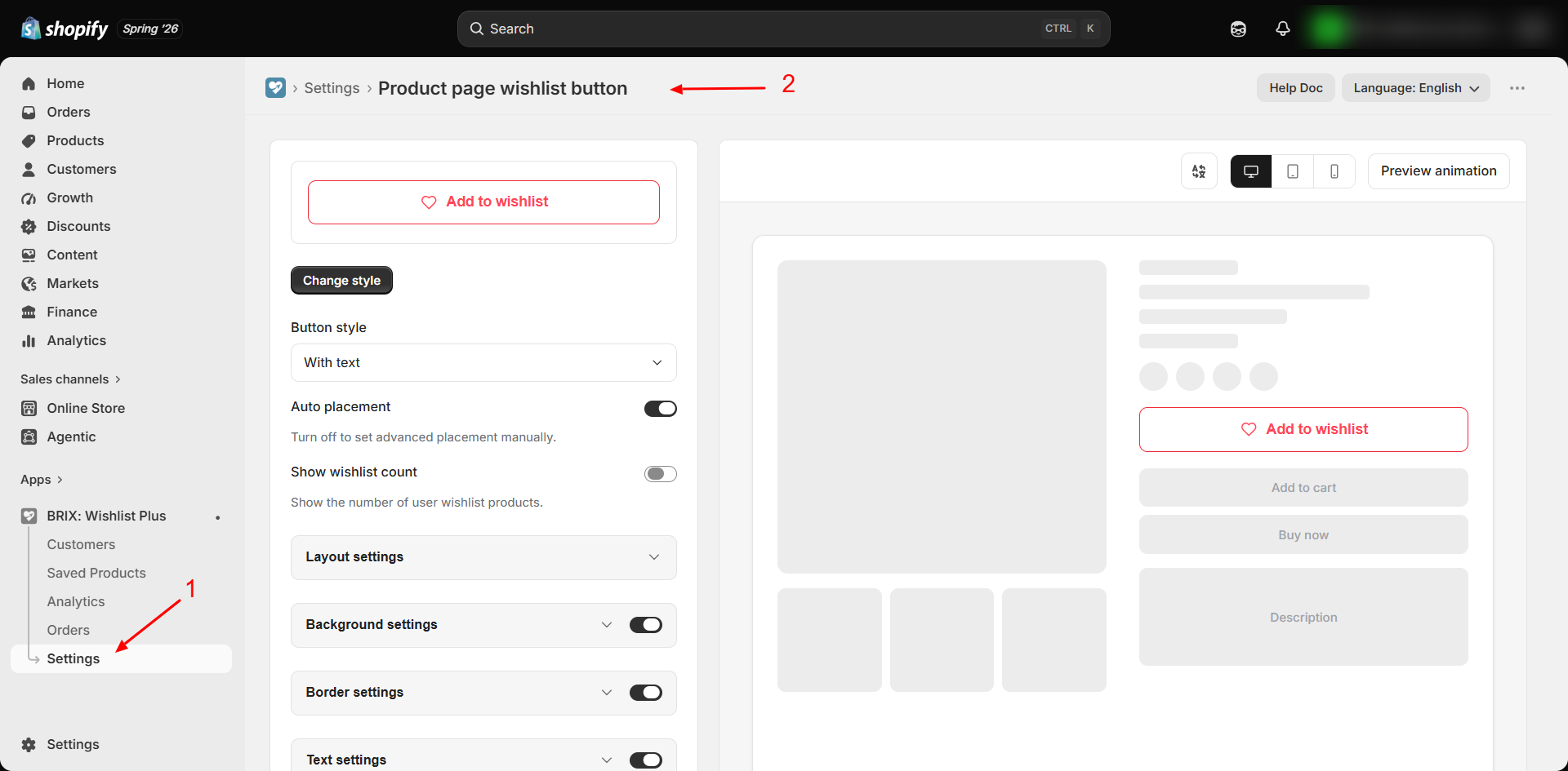
Apps → BRIX: Wishlist Plus → Settings → Buttons tab → Product page wishlist button → Customize
How to Use
- Open the app and go to Settings.
- Find Product page wishlist button under the Buttons tab (enabled by default).
- Click Customize.
- Choose a Button placement and Button style. If you pick Custom placement, follow Custom placement below.
- Optionally click Change style to start from one of 13 built-in color presets.
- Adjust general layout, background, border, text, and icon settings as needed.
- Translate the button's text if your store supports multiple languages.
- Review the live preview, then click Save.
Available Settings
Style presets
A "Change style" picker offers 13 ready-made color combinations (outline or filled, in red, green, blue, orange, purple, teal, pink, navy, and black). Selecting one instantly applies matching background, border, text, and icon colors. Default: Outline red.
General
| Setting | Description |
|---|---|
| Button placement | Above the Add to cart button, Below the Add to cart button, Top right of product image (icon only), or Custom placement (default: Above the Add to cart button) |
| Button style | Button with text, Button with icon (no label), or Icon only (a bare icon with no button around it). Hidden for Top right of product image, which is always icon only (default: Button with text) |
| How do you want to add it? | Shown only for Custom placement: Custom div or Manual block. See Custom placement |
| Show wishlist count | Display the shopper's total number of wishlisted products on the button (default: off) |
The Change style preset picker is hidden when Button style is Icon only, because presets style the button box. When the button sits on the product image, it has its own icon settings. Until you change them, it matches your Product Grid Button icon.
Custom placement
Use Custom placement to put the button anywhere on your product page, for example next to the product title or inside a quick view popup. There are two ways to add it:
| Option | How it works | Best for |
|---|---|---|
| Custom div | Click Copy to copy a short code snippet, then paste it into your theme code where you want the button | Developers, custom sections, and quick view popups |
| Manual block | Click Add block to open your theme editor. Place the Wishlist button block where you want it on the product page, then save the theme | No code needed |
The Custom div snippet:
html
<div class="brix-custom-prod-widget-placement" data-wishlist-target="product-button" data-product-handle="{{ product.handle }}"></div>- To mix a full button and an icon on the same page, add
data-wishlist-display="icon"ordata-wishlist-display="button"to an individual div. - The Wishlist button theme block has a Display as setting: Use app setting (default), Full button, or Icon only.
Layout
| Setting | Description |
|---|---|
| Button width | Full width or Fixed width (default: Full width) |
| Fixed width / alignment | Pixel width and Left/Center/Right alignment, shown only when Fixed width is selected |
| Padding (vertical / horizontal) | Sliders controlling inner spacing (default: 12px / 20px) |
Background (can be turned off to inherit your theme's own button background)
| Setting | Description |
|---|---|
| Background color | Default state color |
| Background color (active) | Color once the product is saved |
Border (can be turned off to inherit your theme's own border)
| Setting | Description |
|---|---|
| Border color | Default: red |
| Border width | 0–6px slider (default: 1.5px) |
| Border radius | 0–40px slider (default: 8px) |
Text (shown only when Button style is "With text"; can be turned off to inherit your theme's own font)
| Setting | Description |
|---|---|
| Font size | 10–22px slider (default: 14px) |
| Font weight | Regular, Medium, Semibold, Bold (default: Semibold) |
| Text color | Default state and active state colors |
Icon
| Setting | Description |
|---|---|
| Icon style | Heart, Star, Bookmark, or Custom SVG upload (max 100 KB) |
| Icon animation | Same 12 animation options as the product grid button (default: Fill) |
| Icon color | Default state and active state colors |
| Icon size | 12–40px slider (default: 18px) |
Translatable text
| Field | Default |
|---|---|
| Before add to wishlist text | "Add to wishlist" |
| After add to wishlist text | "Remove from wishlist" |
| Loading text | "Loading..." |
Best Practices
- Start with Above the Add to cart button or Below the Add to cart button. They work on most themes with no extra setup.
- Use Manual block if you want a custom position but don't want to edit theme code.
- Use Custom div for quick view popups or custom product sections, where a theme block can't be added.
- If space is tight, such as next to the product title, use Icon only. Check the Mobile preview before saving.
- Turn off Background, Border, or Text sections individually if you'd rather the button visually match your theme's native buttons exactly.
Notes
- If a product has multiple variants and no variant is selected yet, clicking the button shows a message asking the shopper to choose an option first.
- Once a variant is selected, that specific variant - not just the product - is what gets saved.
- If Multiple wishlists is enabled and the shopper already has more than one list, adding a new item opens a quick picker so they can choose which wishlist to save it to.
Troubleshooting
The button appears in an odd spot on my product page. Switch Button placement between Above and Below the Add to cart button. If neither works on your theme, use Custom placement and add the button yourself with Manual block or Custom div.
I chose Custom placement but the button doesn't show. Custom placement only shows the button where you added it. With Manual block, confirm the Wishlist button block is on your product page template and the theme is saved. With Custom div, confirm the snippet is pasted into your live theme's product template or quick view code.
The button text isn't translated even though my store has other languages. Open the Translate button text modal and confirm you've entered translations for each secondary language - the app doesn't auto-translate storefront languages you haven't configured. See Storefront Translations.
Clicking the button shows "Please select an option" even though I see one variant. This means your theme hasn't communicated the selected variant to the page yet - try selecting the option again directly in your theme's variant picker.