

Appearance
Wishlist Header Icon
A heart icon with a live item-count badge, placed in your store's header next to your search and account icons.
Overview
The header icon gives shoppers a familiar, always-visible way to open their wishlist from anywhere on your site - similar to a cart icon. The app automatically looks for your theme's header icon row and inserts the wishlist icon there.
Benefits
- Puts the wishlist somewhere shoppers already expect to find store icons (next to cart, search, account)
- Shows a live count badge so shoppers can see at a glance how many items they've saved
- Fully customizable to match your theme's existing header icon style
Where to Find It
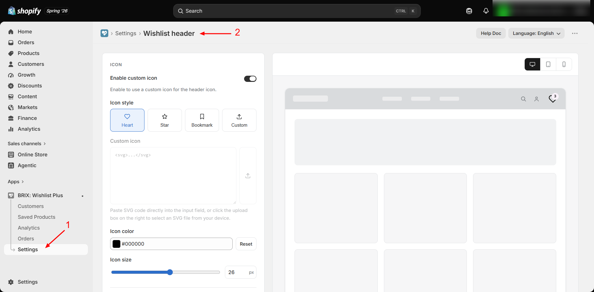
Apps → BRIX: Wishlist Plus → Settings → Widgets tab → Wishlist header → Customize
How to Use
- Open the app and go to Settings.
- Find Wishlist header under the Widgets tab (enabled by default).
- Click Customize.
- Adjust icon style, size, and color to match your header's other icons.
- Configure the count badge, spacing, and optional background.
- Optionally set a Custom header selector to choose exactly where the icon goes.
- Review the live preview, then click Save.
Available Settings
Icon
| Setting | Description |
|---|---|
| Enable custom icon | Turn on to use your own icon instead of the built-in set (default: off) |
| Icon style | Heart, Star, Bookmark, or Custom - only editable when custom icon is enabled (default: Heart) |
| Custom icon | Paste SVG code or upload an SVG file, only available when Icon style is Custom |
| Icon color | Default: red (#FE0606) |
| Icon size | 0–48px slider (default: 26px) |
Spacing & Background
| Setting | Description |
|---|---|
| Left spacing | Space between the wishlist icon and the header icon to its left, 0–40px (default: 14px) |
| Right spacing | Space between the wishlist icon and the header icon to its right, 0–40px (default: 0px) |
| Show background | Adds a solid round background behind the icon (default: off) |
| Background color | Only shown when "Show background" is on (default: white) |
| Icon padding | Space between the icon and the background edge, 0–30px, only shown when "Show background" is on (default: 10px) |
Item Count Badge
| Setting | Description |
|---|---|
| Show wishlist count | Displays the number of saved items next to the icon (default: on) |
| Show number background | Adds a round background behind the count number (default: on) |
| Number background color | Only shown when "Show number background" is on |
| Number background size | 10–32px slider, only shown when "Show number background" is on (default: 18px) |
| Number text color | Default: black |
| Number size | 6–20px slider (default: 9px) |
Placement
| Setting | Description |
|---|---|
| Custom header selector | CSS selector of the header element the icon attaches to, for example .header__icons. Leave empty to detect the header automatically (default: empty) |
| Insert position | Where the icon goes relative to that element: Inside, at the end; Inside, at the start; Before the element; or After the element. Only used with a custom selector (default: Inside, at the end) |
Use Before the element or After the element when your theme's icon row is a flex container and the icon must sit next to it rather than inside it.
Best Practices
- Match Icon size and color to your theme's existing cart/search/account icons for a consistent header look.
- Use "Show background" if your theme's icons already sit on colored circles or squares.
- Keep the count badge on - it's one of the clearest signals to shoppers that they have saved items waiting.
Notes
- By default, placement within the header row is automatic and depends on your theme's markup. To control exactly where the icon goes, for example directly before your cart icon, set a Custom header selector and Insert position.
- Clicking the icon opens the wishlist panel, or navigates to the dedicated wishlist page if that display style is selected. See Wishlist Page.
- This screen has no "Translate" or "Preview animation" option since it has no customer-facing text and no click animation - only a device preview toggle.
Troubleshooting
The icon doesn't appear in my header. Confirm the "Wishlist header" toggle is on in Settings, and that the theme app embed is enabled. Some highly customized headers may not have a detectable icon row. In that case, enter your header icon container's CSS class in Custom header selector. Contact support if the icon is still missing.
The icon appears in the wrong spot within the header. Adjust Left spacing / Right spacing. If the icon lands far from where you expect, set a Custom header selector that points at your theme's icon row, then try each Insert position.
The icon disappeared after I entered a custom selector. The selector doesn't match any element on your storefront. Check the class name in your theme code (for example .header__icons), or clear the field to go back to automatic detection.