

Appearance
Find a Store Button
Configure the floating button that opens your store locator from anywhere on your site.
Overview
The Find a Store button is a floating, storefront-wide button turned on via the app's theme embed. Its icon, colors, animation, position, and text are all configured from this settings page.
Benefits
- Gives customers a locator entry point on every page, not just where you've added the full block
- Fully custom icon, colors, and position to match your brand
- Live desktop/mobile preview while you edit
Where to Find It
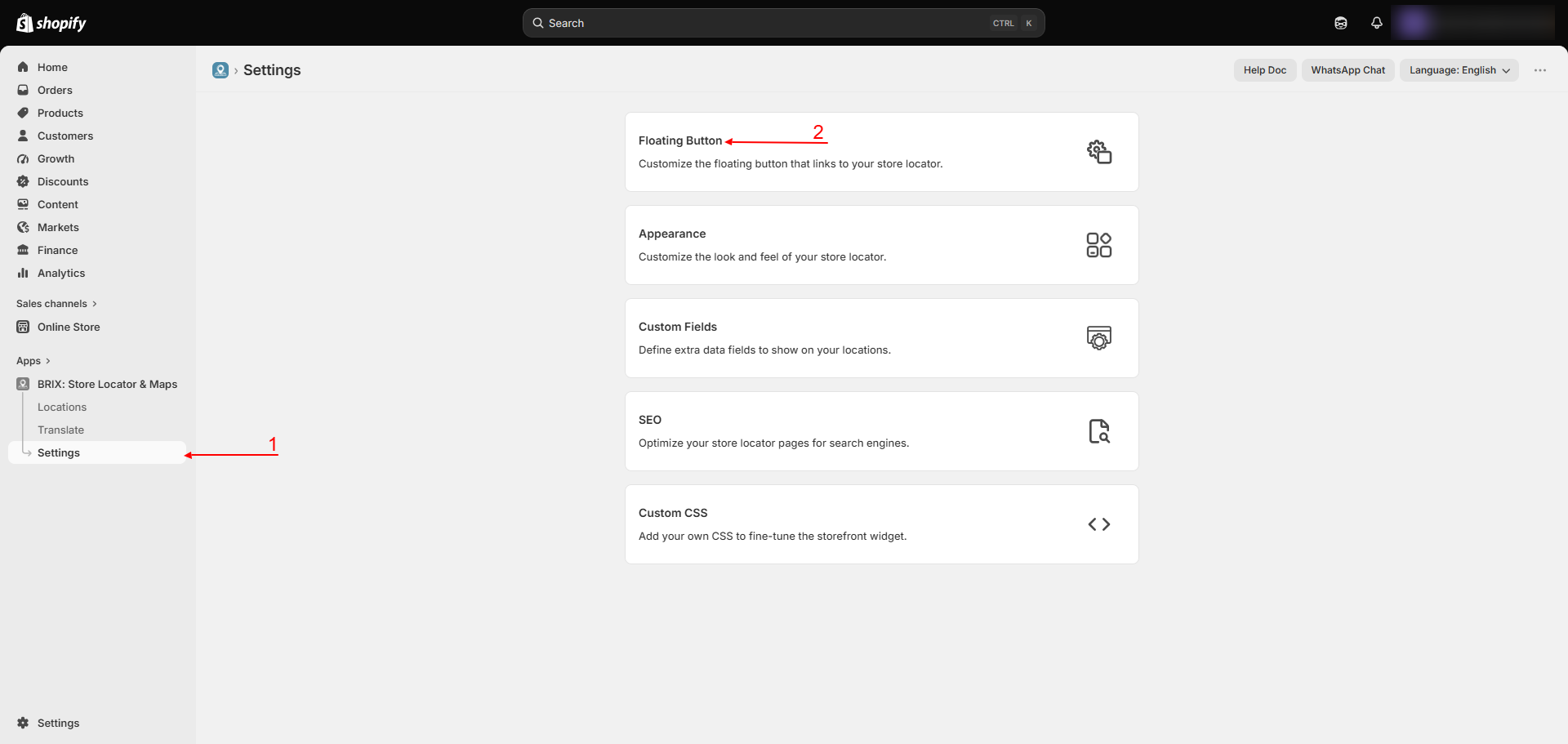
Apps → BRIX: Store Locator & Maps → Settings → Floating Button
How to Use
- Open Settings → Floating Button.
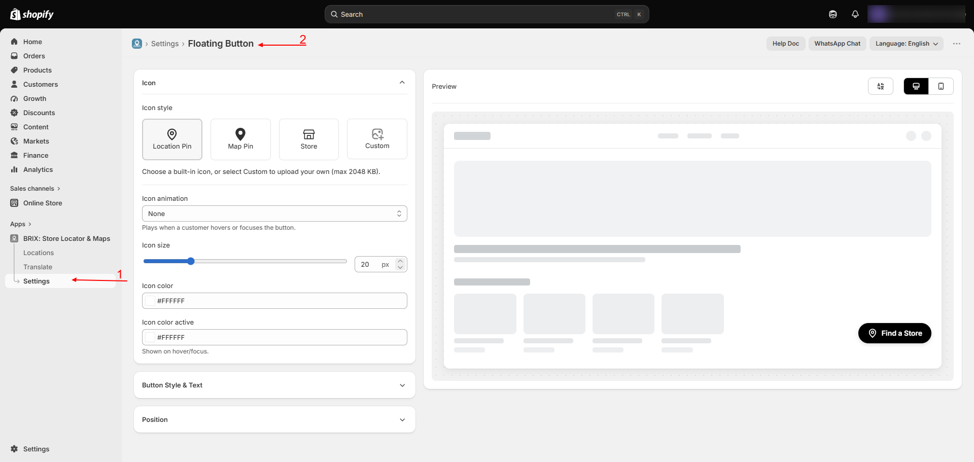
- Under Icon, choose a built-in icon (Location Pin, Map Pin, Store) or upload your own custom icon, then set its animation, size, and color(s).
- Under Button Style & Text, choose Icon with text or Only icon, and set the background (and text) color.
- Under Position, choose Bottom left or Bottom right, or turn on custom positioning and set exact X/Y offsets.
- Check the live preview, switching between Desktop and Mobile.
- To change the button's text, go to Translate → General - the label itself is edited there, not on this page.
- Click Save.
Available Settings
| Setting | Description |
|---|---|
| Icon | Location Pin, Map Pin, Store, or a custom uploaded icon (up to 2MB) |
| Icon animation | None, Fill, Cross fade, Scale swap, Rotate swap, Flip 3D, Slide left, Radial, Wipe right, Swing, Bounce, or Flip |
| Icon size | 12-48px |
| Icon color / Icon color active | Colors for the icon in its normal and active states |
| Button style | Icon with text, or Only icon |
| Button text color | Text color (hidden when Only icon is selected) |
| Button background color | Background color of the button |
| Position | Bottom left or Bottom right, plus optional custom X/Y offsets (up to ±500px) |
| Button text | Edited on the Translate page, not here - see Translations |
Best Practices
- Choose an icon and color combination that stands out against your storefront's background on both desktop and mobile.
- Use custom X/Y positioning sparingly - the default corner positions avoid overlapping common theme elements like chat widgets.
- Check the Mobile preview - a button sized well on desktop can crowd a small screen.
Notes
- This page has no on/off toggle of its own - the button is turned on or off entirely by the app embed in your theme editor (see Storefront Widget Setup).
Troubleshooting
My custom icon upload didn't save. Confirm the file is under 2MB and try again; if it still fails, use one of the built-in icons instead.
The button text didn't change after I edited it here. Button text is edited on Translate → General, not on this page - see Translations.